Movicon.NExT Help on Line - Tutorial
The Movicon Symbol Library contains ready to use predefined and configured static and dynamic symbols. This library can be accessed from the screens using the Symbol Gallery tab located to the right of the workspace.
The "Symbols Library" contains graphical design symbols sub-divided into different categories. This library is activated using the Symbol Gallery tab on the right of the screen and can be kept visible or positioned to where pleased within the workspace.
|
|
The symbols refer to different sources and are selected through the source related tabs:
|
|
|
The symbols are XAML-based and the library is protected and encrypted for protection purposes by default. |
The symbols are subdivided into different categories in the "Symbol Gallery" window. Each category contains a series of symbols divided into groups using the tree structure:
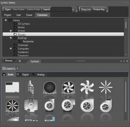
The "Symbol Gallery" contains Symbols divided into different categories and groups.
To insert an object or symbol on screen according to the window from which it is selected proceed as follows.
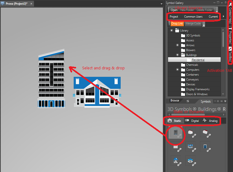
To insert a symbol using the Movicon Symbol Gallery follow these quick simple steps:
Open the screen of interest within the Movicon workspace
Activate the Symbol Gallery if not already opened in the foreground
Select the one of the Categories, e.g. "Project", "User"or "Common" from which to withdraw a symbol.
Select the symbol from the tree structured symbol list and click on the icon to expand the group
Select the symbol desired from the bottom part of the window symbol previews are displayed and drag and drop it on screen
